Problems
During a market research in July 2023, 67% of the students reported:
"I can't recall the logo for Huddersfield or the colours representing Huddersfield. Also, the texts on the website are slightly difficult to read."
Based on students' feedback, the UX/UI team discovered the following problems with previous branding:
-
Logo: not graphical and colour-wise consistent
-
Typography: inaccessible and inconsistent font style
-
Colour palette: inconsistent colours
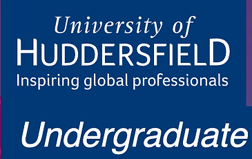
Graphic 1: The logo is not graphical and or colour-wise consistent.

Graphic 2: Two types of fonts are displayed on the same webpage, and Foco (second arrow) is not modern and accessible.

Graphic 3: Two shades of brand blue are displayed on the same navigation.
Solutions
Logo
The University of Huddersfield identifies itself as a Higher Education institution that inspires global professionals.
Based on competitive research of all HE institutions' brands across the Yorkshire and Humber region, the following opportunities to reposition the logo were found:
-
Letter "H": 0 universities use the letter "H" as a part of their logo.
-
"Global": 0 universities use the concept of "global" as a part of their logo.
Hence, the letter "H" with a globe can be a distinguishing logo for the University of Huddersfield. Here is the result of the redesigned logo and the concepts behind it:
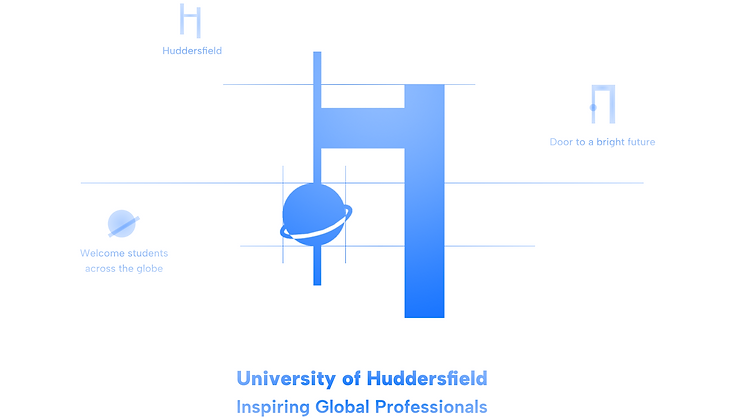
Graphic 4: Redesigned logo and the concepts behind it
Typography
Based on UI design trends, sans-serif fonts, compared to serif fonts, have the following benefits:
-
Enhancing accessibility by increasing readability
-
Working well with little space for copies
Hence, Albert Sans replaced Foco as the typography for Huddersfield's website. Here is the result of the redesigned typography:
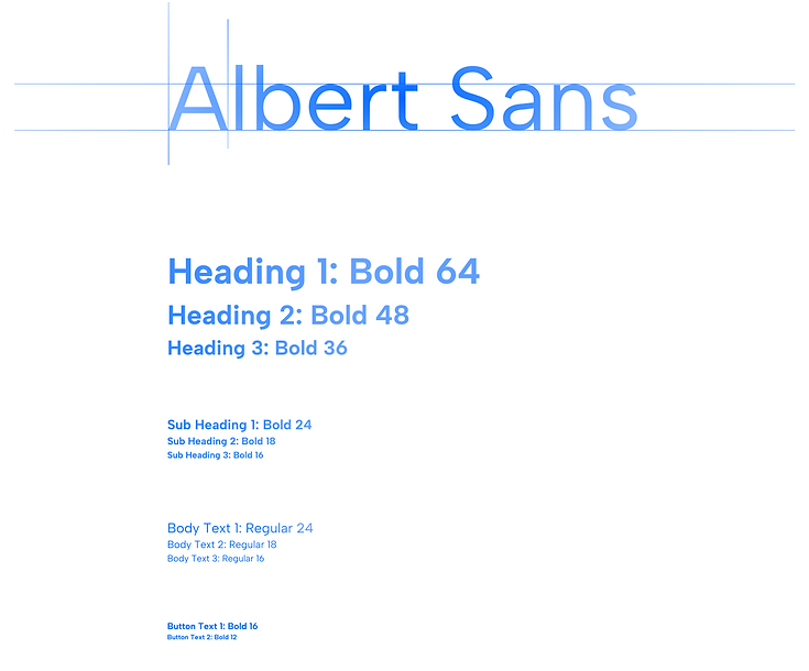
Graphic 5: Redesigned typography and how it's applied to the text hierarchy
Colour Palette
Based on colour psychology, blue gives people a sense of authenticity and trust, which fits the university's organisational image very well. However, the previous blue was very dull. Hence, Blue Ribbon (Hex: #0066FF) was chosen to add vibrancy and energy.
Additionally, the university has been promoting its TEF Gold award, hence orange colours with Hex numbers starting with #FF (to go with Blue Ribbon #0066FF) were added to the colour palette.
Here is the result of the redesigned colour palette:
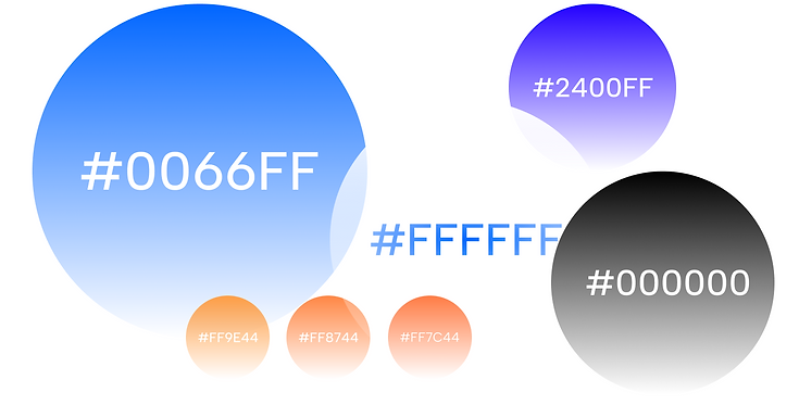
Graphic 6: Redesigned colour palette and the emotional impacts of each colour